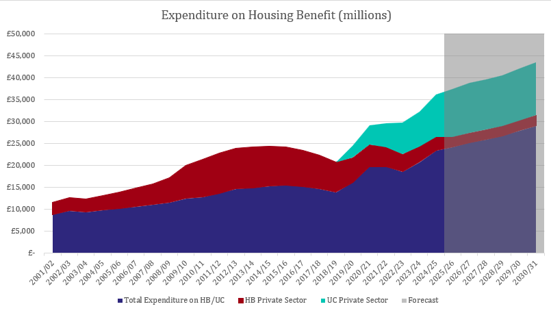
Tim Williams posted a chart on LinkedIn recently plotting soaring Housing Benefit expenditure against our miserly investment in new affordable homes. It’s a good chart but I thought I would add a little more detail.
What this shows is where that money ends up. The dark blue is social sector expenditure – often, the state paying benefits to itself. The red and the teal is private sector expenditure – the state paying public money to private landlords.
That component is up from <£3bn in 2001/2 to £13bn today.
The growth is relentless. And you see that dip in the middle? That’s probably just missing data. The Government does not seem to have recorded how much of Universal Credit was going to Private Landlords until 2019.
And, by the way, this does not mean that Government is throwing money around. The maximum amount of support you can claim with private sector housing costs is based upon the Local Housing Allowance, which is well below the ostensible peg to the 30th centile rent. Nationally, just under 30% of private renter households have a valid claim for assistance well over half are unable to claim enough to fully offset their housing costs. That is about 700,000 households in a de facto benefit sanction.
The only way to fix this is to build enough affordable homes to move these households out of the Private Rented Sector and into the Social Rented Sector. Doing so would halve their rent (or better) and vastly reduce their need for support.
Tim Williams posted a chart on LinkedIn recently plotting soaring Housing Benefit expenditure against our miserly investment in new affordable homes. It’s a good [...]
Tim Williams posted a chart on LinkedIn recently plotting soaring Housing Benefit expenditure against our miserly investment in new affordable homes. It’s a good [...]
The amount that different local authorities in the UK build varies quite a lot. It doesn't make nearly as much difference as you would think to the price of homes.
Tim Williams posted a chart on LinkedIn recently plotting soaring Housing Benefit expenditure against our miserly investment in new affordable homes. It’s a good [...]