16 Jun 2026|Uncategorised
Where is Housing Benefit Expenditure Going?
A week or two ago, The New York Times published a fascinating piece of data journalism, arguing that America needed to build more homes.
16 Jun 2026|Uncategorised
A week or two ago, The New York Times published a fascinating piece of data journalism, arguing that America needed to build more homes.
There’s a paywall but good journalism is important [and the crucial chart has been screenshotted and on twitter many times already]
The heart of the argument was a chart, towards the end of the piece which compared affordability (house prices/incomes) to construction rates (homes built each year per 1,000 households). The data showed very much the pattern that a Yimby might predict. A big cluster in the bottom left (e.g. Chicago) with two distinct projections: expensive cities who don’t build a whole lot (e.g. New York, LA, Chicago) and cheap cities who build loads (e.g. Houston, Atlanta, Austin). Almost nowhere that builds a lot is expensive.
Case closed. The Yimbys win.
I immediately wanted to compare notes with the UK but I had to wait a bit because something about the scale of the axes looked off to me and I had to bounce a few emails off the corrections and discuss it with the data team Sara Chodosh to get that fixed. thank you too, to Cameron Murray for his help with that. Anyway, The New York Times has now made a small adjustment and I am now fairly confident that the data in my chart is (broadly) comparable with the one on the NYT’s website.
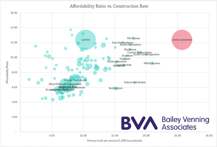
I’ve plotted London (twice), the next six major conurbations (Greater Manchester, West Midland Conurbation, Liverpool, Sheffield/Rotherham, Newcastle/Gateshead and the West Yorkshire Built Up Area) and then rounded out with all the local authorities with 60k households or more.
The data is a completely different shape. First off, there’s a lot less variation. That, I think is to be expected in a much smaller, more densely populated area like England.
The first thing you notice is that the “virtuous” arm of cheap cities who build a great deal is completely absent. But, not only that, it’s the entire band of cheap cities across the bottom of the chart that’s missing. There are a lot of those in the US data but almost none in England. The only major city with an affordability ratio less than six is Newcastle/Gateshead – and then only just.
But the absence of the build-a-lot arm might have something to do with absolute values as much as affordability. Austin is a tech boom town and incomes are rocketing alongside the booming population. The NYT notes, approvingly that you can buy a two-bedroom new build on the outskirts of metro Austin for $325,000. I can find two-bed new builds in Newcastle for £170,000 ($225,000) – that’s a lot less.
The ingredients for a housing boom are prices at low multiples of strong wages. Maybe low multiples of weaker wages are simply too low to invite investment…
The next thing you notice is that all of the major cities bar London were clustered pretty close together. Affordability ratios vary by just 25% between the six of them and output by less than 50%. Among the major cities in the NYT data, the affordability ratio varies by 270% between the most affordable major city (Chicago – 4.4x incomes) and the least (San Francisco – 12.4). Construction activity varies by an eye-popping 870% between the city building the least homes (Chicago again – 4 homes/1,000 households) and the one building the most (Austin – 35 homes/1,000 households).
If you want to locate all those UK cities on the US chart, they’d be clustered around Boston.
Intriguingly, the empty quadrant that NYT had in the top right corner (high prices, and lots of construction activity) isn’t quite so empty in my data but, when you look at the labels, it’s obvious why not. Most of those places are satellite markets to more expensive cities – Oxford, Cambridge and, of course, London.
But it’s the plot(s) for London itself that I think are most significant.
With prices at 12.4x incomes, London is as expensive as San Francisco – the most expensive city in the US data. And, in the five years to 2024, it was already building more than any of the other large cities in the country – an average of 35,000 each year. At 10.4 homes/1,000 households, it was therefore building at almost twice the rate of New York, LA or San Francisco (6 homes/1,000 households) and getting on for the same number as Portland (which is far smaller).
But London has been told that the reason it is so expensive is because it does not build enough. A new target of 88,000 homes per annum has been handed down from on high. That would be 25.7 homes per annum/1,000 households. Which is, of course, the red plot. In British terms, it’s more than any of the other places on my graph and the only cities that come close are Milton Keynes (and Preston – although it’s not quite big enough to find it’s way onto the graph).
In US terms, there are two large cities which achieved similar levels of growth – Houston and Dallas (both managed 24 homes/1,000 households).
So, one question would be, should London grow as fast as Houston or Dallas? London is, I think about half as dense again as either of those cities, which is an obvious challenge, but I would love to hear from people know them well about what they did to achieve that growth.
But I think it is worth noting that Houston, Dallas and Austin, as well as a good many of the other cities in the “growth” arm of the US data are boom towns. Austin is a small city that got the Gigafactory. Houston and Dallas are (I think) still oil towns at a time when the US was busily becoming the world’s largest energy producer.
It is surely the economic boom that makes the housing boom. And, as we can see by comparing the two charts, the ingredients for such a boom are homes at low multiples of large wages.
It’s not immediately obvious how London or any of the other big cities in England are planning to conjure up an economic boom. And so, the more pertinent question would be can London grow at anything like those rates?
The completion data in my chart runs to 2024 (it’s the completion data used as the basis of the Government’s new Standard Methodology) so it pre-dates the recent collapse in output. It won’t be news to anyone on here that London did not build 35,000 homes last year, in 2025 it built what? 7,000 homes? Tim Craine will correct me.
As we know, developers are struggling to cut prices to a level where the demand exists to absorb the current output. But look again at the chart. Let’s say that Steve “Build Baby Build” Reed is right and that the solution is indeed 88,000 homes a year.
That output would seem to imply much lower prices. And developers are already struggling in the current softening market- that’s why output fell so fast. If we could wave a magic wand and complete 88,000 homes a year, prices would fall further and faster still.
Which would be great news for everyone except the people that built them.
To achieve it, we’d need a radical transformation of London’s delivery model – not just a new and more ambitious target. Unless anyone has a plan for that, London isn’t going to succeed at building 88,000 homes a year.
So, my humble suggestion.
Perhaps we should start from what London seems short of: social housing, certainly, but also good quality family homes in medium rise buildings that can be marketed not to first time buyers but to families (and would-be families) living in flats which they have a chunk of equity in but which they have outgrown.
Per square foot, the values will be lower but, from what I am seeing, so are the build costs. And, whilst you don’t get as many of that type of homes on a site, the land value per plot that drops out of the bottom of the appraisal might be a good deal higher than it is for high rise one and two bed apartments.
The main argument for not doing that (I am very open to hearing others) is that it doesn’t maximise output and won’t meet the 88,000 homes/year target. But, looking at the data above and at the current output, that target wasn’t happening anyway.